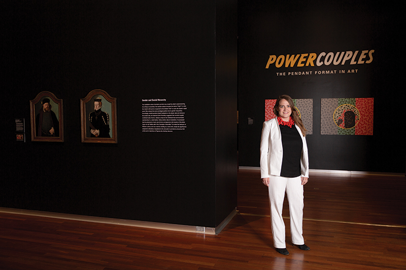
Two for All – Power Couples: The Pendant Format in Art
Art
On the far wall of UMFA’s newest exhibit, Power Couples: The Pendant Format in Art, hangs the infamous Harry Nilsson lyric: “One is the loneliest number.” Of course, there is no invocation of this lyric without thinking of its Three Dog Night instrumentation and the way it pairs with Nilsson’s songwriting—the two groups creating from their individual sense of rock and pop. I used to harbor resentment for the term “power couple,” the implication that two is better than one. But seeing this lyric here disarmed me. Power Couples focuses on pendants, a form of art and presentation that focuses pairs. How is art made more powerful when conceived as a pair? When is two better than one?
Artistically, we use the term diptych interchangeably with pendant these days. Historically, diptychs connote a portable dimension and hinged form, and they were popular for use in private devotionals in medieval Europe. Pendant is a term more capacious, meaning two pieces similar in subject matter and composition that both rely on each other to make full meaning of one another, though they need not be physically connected to be considered a pendant. Space, hence, immediately becomes an important consideration.
“Quickly evident [in Power Couples] is the power dynamic of space.”
The exhibition provides a familiar baseline for this in Portrait of a Gentleman and Portrait of a Lady, two 16th-century oil paintings by Barthel Bruyn that pose two portraits of an aristocratic man and woman, each painting and facing each other. Pendants reinforced the perception of a couple as a unit, and though it’s a type of portraiture you’re probably familiar with, the seemingly innocuous composition is built on a certain understanding of gender, revealing a sense of the social order when looked back on as a convention. Men might hold books to suggest they were well-read moneymen. Women posed in feminine, domestic clothing to insinuate their role in home life. Typically, the superior subject occupies the right side (the observer’s left side), and the inferior the left. As you may guess, men almost always lived on the right side. Quickly evident is the power dynamic of space, how this format’s power derives from its placement in the real world.
From Bruyn on, the exhibit showcases pieces that wrinkle the pendant convention as it’s first presented to us. A 17th-century painting, Portrait of a Woman by Pieter Dubordieu depicts a woman resting in a three-fourths-profile view reminiscent of Bruyn’s couple just nextdoor, but her match is missing. Instead, the exhibition provides a mirror installed with a like frame, allowing the viewer to insert themselves into the pendant. This is powerful. The mirror interpolates you into a convention that originally had made room for a specific person, so depending on your identity, the meaning of the pendant can change radically. This makes a swift argument for the power of pendants: When meaning is dependent on a second piece, there’s enormous room to play. This shows what two pieces can accomplish together that one, alone, cannot.
“Some of the most fascinating pieces of this exhibit challenge the gut responses that exposure to the form builds up in you.”
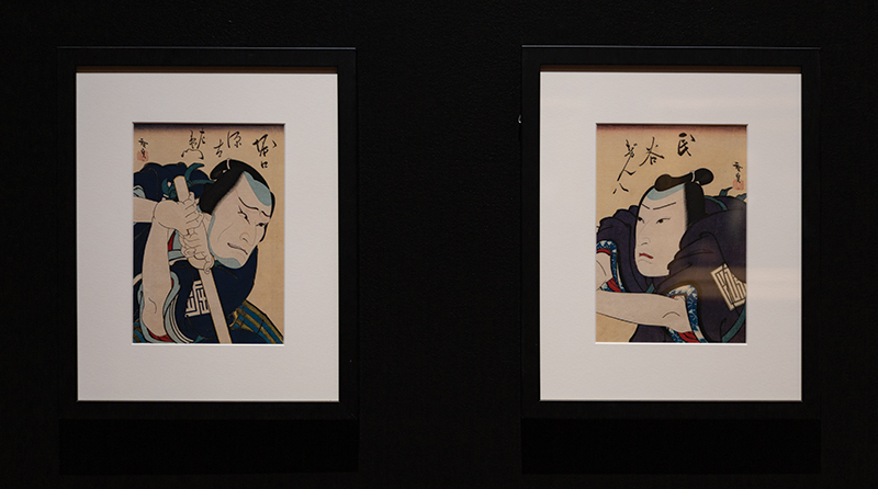
Power Couples builds this idea up by showing the historical roots of pendants, then deconstructs the question through contemporary and historically uncharacteristic examples of the form. A painting of Italian silent-film actor Rudolph Valentino shows him in leather chaps, spurs and a bolero jacket, posing him as a dapper gentleman from the Spanish region of Andalusia. Valentino requested a companion portrait from the painter Federico Beltrán Masses, which Valentino described as “a Persian ruler of the time of the crusaders.” Similar to Dubordieu’s piece, this companion piece has been separated from its pair, but because these outfits and depictions don’t correlate to any specific role Valentino performed, they function to suggest Valentino’s range as an entertainer rather than a portraiture of his nature. You see this trend toward celebrity reflected in other examples, too, such as Konishi Hirosada’s color woodcuts from the 19th century, which depict performances from two Kabuki theatre actors in The Infants’ Vendetta. These popular images show a movement toward idolatry in the form.
Some of the most fascinating pieces of this exhibit challenge the gut responses that exposure to the form builds up in you. Robert Rauschenberg’s 1974 piece Treaty is abstract and difficult to parse in a way familiar to Rauschenberg but complicated to pendants. Two prints feature a neck scarf, crumpled grocery bags, a child’s shirt and cheesecloth. Rauschenberg found these items near the Universal Limited Art Editions workshop on Long Island where the prints were made. Easy to look at and hard to unpack, Treaty is an interesting inclusion in this exhibition for its relative illegibility.
“A good exhibit is like catching a bug, a reeling cold that forces a new lens—for days after you will see pairs and the absence of pairs.”
By far, my favorite work is Kerry James Marshall’s Diptych Color Blind Test, which you’ll see hanging in the back half of the exhibit on entering. Inspired by Marcus Garvey’s African flag, the tricolor panels mimic the Ishihara test, most likely known to you and me as the colorblind test. In the middle of these are portraits of a black man and woman in each (the male form occupies the right spot), sporting Afro hairstyle with black turtleneck, fists raised in the Black Power salute. They look as though from the Black Panther party, and their black skin interrupts the classic grade-school test of color perception. This is a piece firing on all cylinders: The initial play into portraiture disrupted by overtly political imagery, the gender and social reinforcement of the male and female placement, the way the red, green and gray colors mirror each other across the pendant—the piece is a brilliant sightline for Power Couples to hand its viewers on entry because of its textured, overtly political play.
There’s so much more to unpack in Power Couples. A good exhibit is like catching a bug, a reeling cold that forces a new lens—for days after you will see pairs and the absence of pairs. It is one of the most generous exhibitions I have seen in a long time, not just in exposure to the museum’s collection but in the careful curation of delineating the levels on which these pendants work—across gender and status, space and time, and conceptually across ideas. If you can make it, I suggest attending Leslie Anderson’s Curator Talk on Wednesday, Aug. 21, at 7 p.m. to hear the thinking behind Power Couples’ meticulous, four-year construction.
Power Couples will run through Sunday, Dec. 8. Information for planning a visit is available at umfa.utah.edu.
More on SLUGMag.com:
Lewitt’s Wall Drawing #33: UMFA Gets Some Sol
Come Together: The International Tolerance Project