Demanding Industries and Underrated Historical Relics: Esko Type Foundry
Interviews & Features
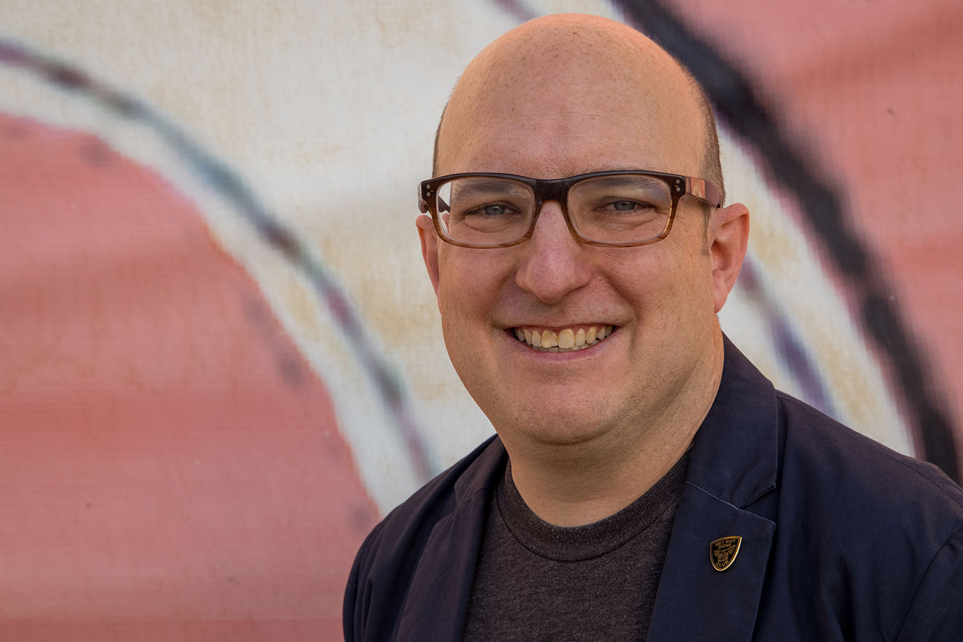
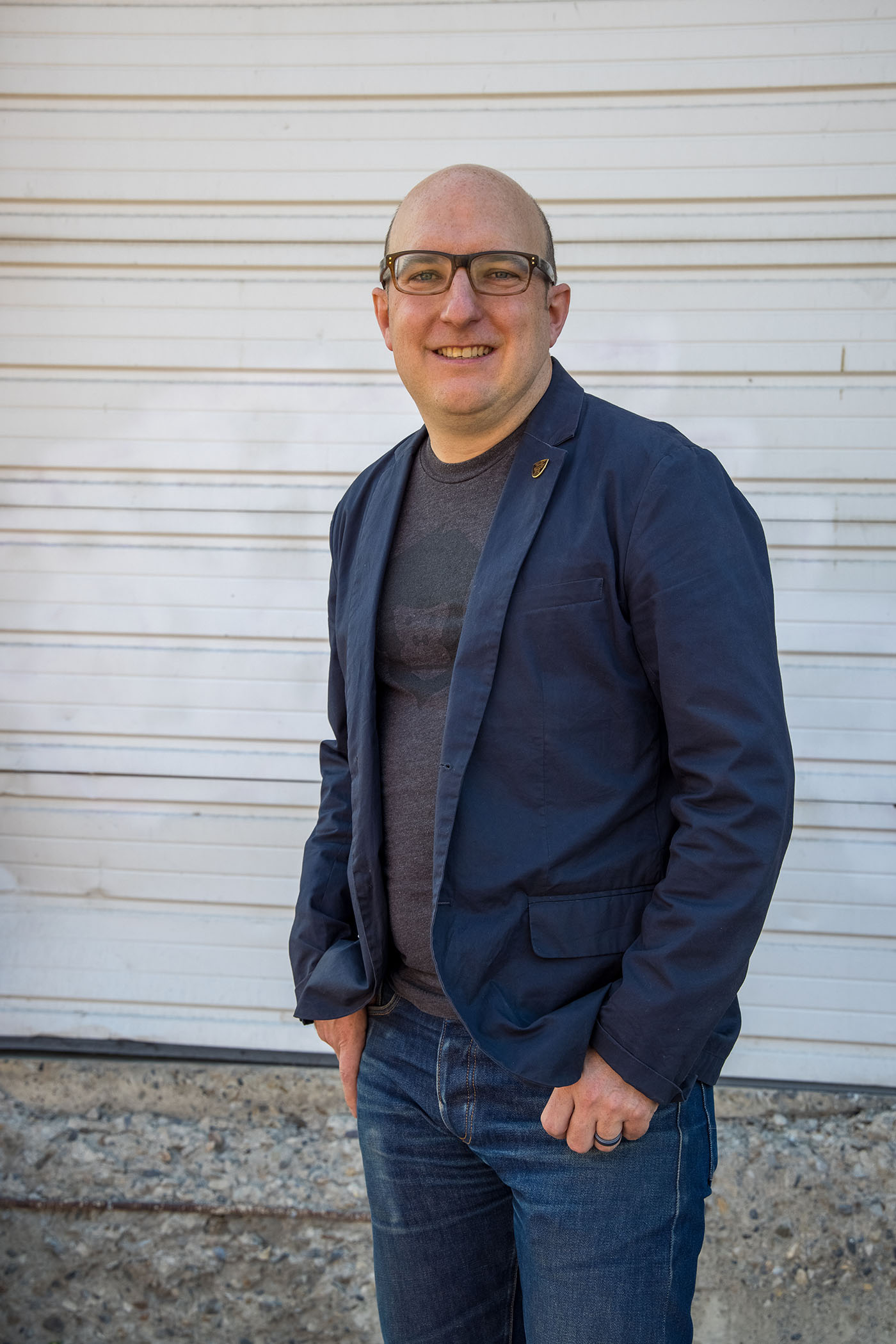
Peter Esko, a graphic designer and photographer, also works as a consultant for design, branding and identity. It should be known that Esko proudly calls himself “a creative evil genius.” He vehemently defies the hyper-specialization versus generality dichotomy by nurturing nuanced services and modes for creative expression. He refuses to sacrifice a diversity of services for hyper-specialization and vice versa. Esko’s decades of design experience, historical affinity, creative curiosity and the demanding reality of business communications led him to establish the Esko Type Foundry. ETF constitutes an offshoot of Works Collective, which is self-described as “the design, copywriting, branding, strategy and creative direction of Peter Esko.”
ETF is an independent type foundry that revitalizes archaic and found typefaces with the two-fold aim of preserving historical relics and diversifying business brand and identity development. “The last 20 years in design, branding and identity development have allowed me to explore so many different aspects of visual communication,” Esko says. “The experience has shown the importance of every layer in the texture of communication and how important type can be in communicating a particular personality or feeling.” Just as one wears vintage clothing to evoke certain emotions and curate an aesthetic, resurrected typefaces awaken memories, lived experiences and emotions that Esko transmutes into a company’s identity development. “When we think of an identity or the ‘brand’ of a particular company or place, typography is one of the underlying elements that contributes a beautiful sense of continuity and texture,” he says.
“The last 20 years in design, branding and identity development have allowed me to explore so many different aspects of visual communication.”
We find ourselves immersed in a visual culture where a company’s success partially hinges on cultivating individuality. ETF complements the Collective’s business-design services by providing another mode for differentiation. “Marketing, branding, advertising and brand identity are all forms of business communications. The need for differentiation is stronger than ever with so many design tools becoming more democratized and available to the public,” Esko says. While ETF is not the lifeblood of Works Collective, it does help integrate vintage typefaces into brand identity. “The intersection of typography with the other aspects of communication drives the desire and need for a business to differentiate itself in a very crowded market,” says Esko.
While the revival of typefaces complements Works Collective’s aim to develop a company’s image or brand, ETF also strives to preserve these evocative historical artifacts. “Custom or commercial projects are possible and encouraged when needed to support a new brand, or strengthen an existing identity, but the main focus is to develop the historical typefaces,” Esko says. Historical typefaces simultaneously preserve the images and emotions from a mural, photograph, street sign or artifact and, sometimes, transmute those sentiments into identity and brand development. “The mission of Esko Type Foundry is to recreate and preserve some typography from the great cities of the world. The type from these locations can continue to carry on the beauty and feel of these places as many reference points for them become homogenized,” says Esko.
“Marketing, branding, advertising and brand identity are all forms of business communications.”
“The first release was Westminster Terminal, based on the classic enameled street signs of London,” Esko says. “These signs have existed in many forms, and there are consistent elements that carry through the different variations.” Esko and his team conduct extensive research to initiate the process of re-creating a particular historical typeface. This process involves “comparing and overlaying different variations of the type … to catalog and find the similarities and factors that go into the creation of a unified representation,” says Esko. After realizing a cohesive image of what the typeface consists of, the ETF team begins to design. “We sketch, craft and refine the shapes of individual letterforms,” Esko says. “[We] work to build out complete typefaces with as much versatility as can be, create the digital type with refinements of kerning pairs. [Then we] create sample materials to show off the qualities of a particular type in use.”
The Esko Type Foundry’s second project derives from a 1912 Eugene Atget photo entitled “Epicerie Fruterie.” Esko says, “The decorative nature of the type is amazingly expressive.” As a writer myself, the type in this photo compels me to abandon my avid use of Times New Roman. It plays with soft curls and pronounced lines—wavering between rounded and abrupt edges. “I am particularly fascinated by the variation even within the limited characters displayed in the original photo. Using those to extrapolate the remaining characters and capture the feeling of the type to represent something that holds a snapshot in time and place is both challenging and inspiring,” he says.
“The decorative nature of the type is amazingly expressive.”
Additionally, the ETF’s third release explores Scottish typography, and particularly, the old ghost signs in Edinburgh. “An outside project that I am working through in my role as creative director for TruHearing [a hearing aid company] is developing a full custom typeface based on the original logo. This work highlights the interesting rounded letterforms that were developed specifically for the mark,” says Esko.
“Travel and exploration have been some of the more meaningful times in my life. I hope to capture and preserve some of those places and some of the historical beauty to further communication needs,” Esko says. As an artist, he discerns the imperative of preserving historical designs, visuals and memories rather than objects; enabling the vivid effects of historic typefaces to reverberate in contemporary contexts. Experience Esko Type Foundry and Work’s Collective for yourself on Instagram at @eskotypefoundry and online at workscollective.com.